Design Explainer
Editor’s note: Earlier this year, independent designer Ben Wilkins and Arkive Design Lead Steffen Nørgaard Panum collaborated to produce the Arkive brand. Originally from Vancouver, BC, Ben Wilkins is a multidisciplinary designer based in San Francisco. Below is an account from Ben about the inspiration behind the logo and the creative process.
Museum branding is a very specific and venerated genre of branding and design. The reason why it holds such prestige with designers is because of the inherent tension between design, which is applied art, and the museum, which houses fine art. Throughout most of human history, we’ve plotted art on this spectrum between applied art, or craft, and fine art—which is elevated in an almost extreme way. But there have also been efforts to trouble this. The Bauhaus and Constructivism in the mid-20th century are just one example. There’s this great quote by Charles Eames, which says something like—design is not art, but if it’s good enough, it may be considered as art.
At the Bauhaus, the idea was to look at typography, layout, and posters etc., to create a sense of rationalism that would “elevate” design and architecture to the level of art. This is why designers now like to name check it so often. There’s no disregarding what they brought to the discipline of design, but there are a lot of things they got wrong as well. They were gender-excluding, Euro-centric, and didn’t really represent a contemporary view on creativity or inclusivity.
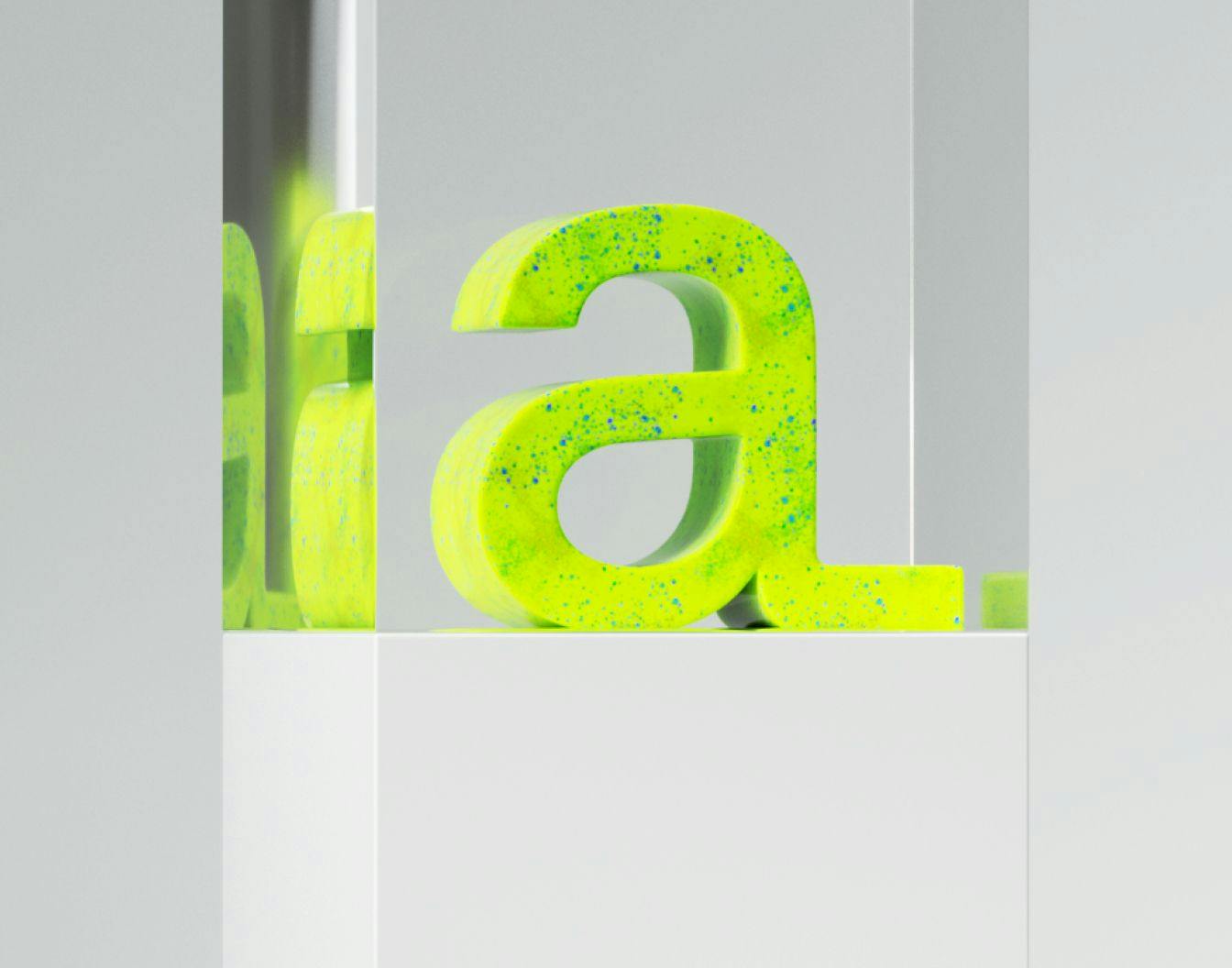
For Arkive, with all of this in mind, I had the strong desire to take all that mid-20th century Constructivist design and just fuck with it a little bit. Shake it up. Everything in art is like a dialogue and we wanted Arkive’s identity to exist within that historical conversation. The Arkive branding should feel web-native and invite in people who might not relate to more traditional branding. If you look at Arkive’s color palette, it’s based on CMYK process printing, but with a very high chroma. In one of the branding documents, we ask ourselves the question: what would Albers do with RGB? The Interaction of Color was such a foundational book for me, with those iconic Albers color experiments illustrating our relative perception of color, but he was doing that all with cut-up pieces of craft paper. The infinite spectrum of light-based color would have blown his mind. So for Arkive, the colors have been pushed to a level of saturation that just wasn’t possible then. You have this lime green which is very vivid, as well as the sharp magenta and cool, icy blue. We used those in contrast with black or neutral tones in order to achieve that electric feel.
For the logotype, I started with the idea of the hypercube, which is a three-dimensional representation of a four-dimensional space. The fourth dimension is time, but you can’t really do that in three dimensions. The shape was difficult to own as a brand and also not particularly unique within Web3. But what stuck about that concept is that museums have this ability to compress time—to reach back and bring things into the present. With the Arkive logo, that was the idea: reaching into the past and compressing into the future.
The distinguishing feature is that the tail of the “A” in Arkive can stretch. It can inhale and exhale, extend and contract. Traditional logotypes had to be iconic and static, such that they could be printed on the side of a train car or read from 200 feet away. But those same constraints no longer apply. Digital brands have this ability to morph and, instead of a single static logo, to have a visual expression that exists over a continuum.
There is both a tension and relaxation that’s inherent to the logo; there’s an anticipation as it is stretched to fill a composition, and a resolution as it snaps back to its canonical typographic form. When we do make physical or printed materials, we can determine where on that spectrum of anticipation versus resolution the brand expression should exist. For something like a hat, it makes sense to use its fully resolved state. But if we’re talking about a future gallery opening, maybe having that anticipatory state might make more sense because the tension helps build excitement.
Over the last hundred years, and more than ever this year, the means of producing art have drastically changed—with technological innovations from the reflex camera to generative AI—and our aesthetic sensibilities are evolving to even keep up. Museums have responded to this innovation by further codifying art, essentially like, “Well, we’ll tell you what art is.” Art is what it has always been in the past. It is an oil painting. It is a sculpture. Arkive strives to be like, “You know what? Art is whatever I fuck with. Let’s take an innovative approach to curation selection and explore new aesthetic possibilities.”
Arkive’s design is still in its infancy, and the brand is meant to evolve, but it remains to be seen how its expression continues to evolve as Arkive takes on physical spaces.